 April 21, 2026
 Canadian Hosting, Hosting, Managed WordPress Hosting Canada, Web Hosting Canada
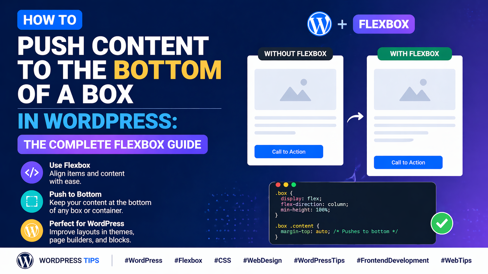
Picture this: you’ve built a beautiful row of three feature cards on your WordPress page. Each card has an icon at the top, a heading, a paragraph of descriptive text, and a “Learn More” button at the bottom. The design looks stunning — until you preview it with real content. One card has two lines of text. Another has five lines. The third has three. Suddenly, the buttons are all at different heights, the cards look misaligned, and that polished, professional look you worked so hard to achieve is gone.
This is one of the most common — and most frustrating — layout problems in WordPress page design. And the solution, once you understand it, is elegant and surprisingly simple: you need to push the button to the bottom of the box using flexbox, so it always aligns at the same height regardless of how much content sits above it.
At 4GoodHosting, we power thousands of WordPress websites through our managed WordPress Hosting platform, with servers in our Canadian Data Centers built for speed and reliability. We see this layout challenge come up constantly among our WordPress users — and in this comprehensive guide, we’re going to solve it once and for all. We’ll explain exactly why this happens, how flexbox solves it, how to implement the fix using both page builder controls and custom CSS, and how to apply this technique to every common layout scenario where it matters.
To understand the solution, you first need to understand why the problem occurs. The root cause is simple: cards with variable-length content will naturally be different heights unless you force them to be the same height.
When you place three cards side by side in a row and each card has a different amount of text, the cards grow to fit their content. Card A might be 280px tall. Card B might be 340px tall. Card C might be 300px tall. Because each button sits at the natural bottom of its card’s content flow — not at the bottom of the card container — the buttons end up at three different vertical positions. The result looks unfinished and inconsistent, even though every other aspect of the design is identical.
This problem appears in a huge variety of real-world WordPress layouts:
In every case, the fix is the same: use flexbox to make the card a column-direction flex container, and push the last element — the button or CTA — to the bottom of the card using the margin-top: auto technique or the justify-content: space-between approach.
Flexbox is a CSS layout model that gives you powerful, predictable control over how elements are sized and positioned within a container. It’s the backbone of modern web layout and it’s the perfect tool for solving the “button stuck in the middle” problem.
Here’s the core insight: when a flex container is set to flex-direction: column and given a fixed or minimum height, its children can be positioned along the vertical axis with remarkable precision. Two specific techniques leverage this for the “push to bottom” use case:
This is the most elegant and widely applicable solution. When you apply margin-top: auto to an element inside a flex container, that element absorbs all the available free space above it — effectively pushing itself to the bottom of the container.
Here’s how it looks in CSS:
.card {
display: flex;
flex-direction: column;
min-height: 300px; /* or a fixed height */
}
.card .button {
margin-top: auto;
}
With this setup, no matter how much or how little content sits above the button, the button always sits at the very bottom of the card. The margin-top: auto instruction tells the browser: “give all the remaining vertical space to the margin above this element.” The button is pushed down as far as it can go.
Key Insight: margin-top: auto only works inside a flex container. Without display: flex on the parent, margin-top: auto has no special effect. Always make sure the card/box is a flex container before applying this technique.
An alternative approach uses justify-content: space-between on the flex container. This distributes the available space evenly between the flex children, pushing the first child to the top and the last child to the bottom of the container.
.card {
display: flex;
flex-direction: column;
justify-content: space-between;
min-height: 300px;
}
The difference between the two techniques: margin-top: auto pushes one specific element to the bottom, leaving all other elements in their natural flow at the top. justify-content: space-between distributes space evenly between all direct children, which can push middle elements to unexpected positions if there are more than two children. For most card layouts with multiple content elements and a button, margin-top: auto on the button is the more reliable choice.
A third technique uses a dedicated spacer element between the main content and the button. The spacer is given flex-grow: 1, which tells it to expand and fill all available free space, pushing the button down.
.card {
display: flex;
flex-direction: column;
}
.card .spacer {
flex-grow: 1;
}
In a page builder, this means adding an empty Spacer module between the text content and the button module, then setting its flex-grow value to 1. This is a useful technique for builders that don’t expose margin-top: auto as a setting, since it achieves the same result through the spacer element instead.
Now that you understand the CSS behind the solution, let’s look at how to implement it practically inside a WordPress page builder — without writing any code.
The first step is to configure your Box module (or Container, or Column — whatever your page builder calls it) as a flexbox column container. In your page builder’s box/container settings, look for the layout section and set the following:
This turns the box into a column-direction flex container. All direct children — the icon module, the heading module, the text module, and the button module — are now flex items arranged vertically inside the box.
For the button-push technique to have any visible effect, the box needs to be taller than its content. If the box only grows to fit its content with no minimum height, there’s no free space to redistribute — all cards will be exactly as tall as their content, and the button will be at the bottom of each card naturally (but at different heights between cards).
Set a min-height on the box. A good approach is to set the min-height to the height of your tallest card — or simply use a value like 350px, 400px, or 450px that gives adequate room for the content without excessive empty space.
Pro Tip: Instead of guessing the min-height, build all your cards first with real content, preview the page, identify the tallest card, and then use that height (rounded up slightly) as the min-height for all cards in the row.
Now apply the push-to-bottom technique to the button element. You have two options depending on what your page builder exposes:
Option A — Use margin-top: auto on the button module:
Option B — Add a Spacer module with flex-grow:
Option C — Use justify-content: space-between on the Box:
The final piece is making sure all cards in the same row are the same height — not just individually taller than their content. This is handled at the row or column level, not the box level.
In your page builder’s row or column settings, look for an Equal Column Heights or Stretch Columns option and enable it. This tells all columns in the row to match the height of the tallest column. Combined with your button-push technique inside each box, the result is a perfectly aligned row of cards — equal heights, buttons all at the same vertical position, regardless of content length.
If your page builder doesn’t expose the flexbox controls you need through its visual interface, custom CSS is your fallback. Here’s a complete CSS solution for the most common card layout scenarios.
/* Make the card a flex column container */
.your-card-class {
display: flex;
flex-direction: column;
min-height: 380px;
}
/* Push the button to the bottom */
.your-card-class .your-button-class {
margin-top: auto;
}
/* Make the row a flex container */
.your-row-class {
display: flex;
align-items: stretch; /* All columns same height */
}
/* Make each card fill its column height */
.your-card-class {
display: flex;
flex-direction: column;
height: 100%; /* Fill the column */
}
/* Push button to bottom of each card */
.your-card-class .your-button-class {
margin-top: auto;
}
You can add custom CSS to your WordPress site at Appearance → Customize → Additional CSS. To target a specific Box module or element, first add a custom CSS class to that element in the page builder (usually found under the Advanced tab in the element settings), then reference that class in your CSS.
Pro Tip: Use your browser’s developer tools (F12 → Inspector) to identify the exact CSS class names applied to your page builder elements. This is much faster than guessing class names and helps you write precise, targeted CSS.
The button-push technique is applicable in many more situations than just feature card grids. Here are the most common real-world WordPress layouts where this technique solves a genuine design problem.
Pricing tables almost always have the same structure: plan name, price, feature list, and a sign-up button. When feature lists are different lengths across tiers, the sign-up buttons end up at different heights — which looks unprofessional on a page that’s all about comparing options side by side.
Apply the technique: make each pricing column a flex container with flex-direction: column, enable equal column heights at the row level, and apply margin-top: auto to each sign-up button. All three sign-up buttons will now sit at the same height — creating the clean, aligned pricing table your visitors expect.
Blog index pages typically show a grid of post preview cards, each with a featured image, post title, excerpt, and a “Read More” link or button. Post titles and excerpts vary wildly in length from post to post. Without the push-to-bottom technique, the “Read More” links float at different heights depending on how long each excerpt is.
Applying margin-top: auto to the “Read More” link in your post card template anchors it to the bottom of every card, creating a clean, professional blog grid where the links are perfectly aligned across every row.
Team pages often use cards with a photo, name, job title, short bio, and sometimes a LinkedIn or contact link. Bio lengths vary significantly between team members. The push-to-bottom technique keeps the contact link or social icon row consistently aligned at the bottom of every card — regardless of how long each bio is.
Service pages with multiple service cards — each with an icon, service name, description, and a “Get a Quote” or “Learn More” button — benefit enormously from this technique. Service descriptions naturally vary in length. Anchoring the CTA button to the bottom of each service card creates a clean, professional services grid that drives conversions without looking unpolished.
In WooCommerce product grids, product names and short descriptions vary in length. If you’re customizing your shop template and want the “Add to Cart” button to always sit at the same height across every product card in a row, this flexbox technique is the solution — applied either through your theme’s CSS or through a page builder’s WooCommerce module settings.
Sometimes, despite applying all the right settings, the button doesn’t push to the bottom as expected. Here are the most common reasons why and how to fix each one.
| Problem | Likely Cause | Fix |
| Button doesn’t move despite margin-top: auto | Parent box is not set to display: flex | Enable flex display on the parent box module |
| Button moves but cards are still different heights | Equal heights not enabled at row level | Enable ‘Equal Column Heights’ or ‘Stretch Columns’ on the row |
| Space-between pushes middle content apart | Too many direct flex children | Wrap top content in a nested box, use margin-top: auto on button |
| Fix works on desktop but breaks on mobile | Mobile overrides the flex settings | Add responsive flex settings for mobile breakpoint |
| Custom CSS class not applying | Class not added to the correct element | Use browser dev tools to verify CSS class is on the right element |
| min-height cuts off content on small screens | Fixed min-height too large for mobile | Use min-height only on desktop; set min-height: auto on mobile |
While the “push the button to the bottom” use case is the most common application of this technique, the same flexbox approach works for any element you want to anchor to the bottom of a container. Here are other practical applications:
The underlying principle is always the same: set the container to display: flex; flex-direction: column, and apply margin-top: auto to the element you want anchored at the bottom. Once you understand this pattern, you’ll recognize opportunities to apply it all over your WordPress layouts.
Mastering flexbox layout techniques like the push-to-bottom pattern is what separates WordPress sites that look professionally designed from those that look like they were assembled without attention to detail. When every button in your card grid lines up perfectly — regardless of how much content sits above it — visitors perceive your site as polished, trustworthy, and well-crafted.
And just as your layouts deserve pixel-perfect precision, your hosting deserves the same standard of quality. 4GoodHosting’s managed WordPress Hosting gives your carefully designed WordPress site the fast, secure, and reliable infrastructure it needs to perform at its best — served from our Canadian Data Centers to minimize latency for Canadian visitors and keep your site loading instantly.
With 4GoodHosting, you’re not just getting a server — you’re getting a fully managed WordPress Hosting environment where updates, security, backups, and performance optimization are all handled for you. So instead of spending time on server management, you can spend it doing what you do best: building beautiful, technically precise WordPress layouts.
Every 4GoodHosting managed WordPress Hosting plan includes:
Whether you’re a solo designer perfecting your card grids, a developer building client sites at scale, or a business owner managing your own WordPress presence, 4GoodHosting provides the managed WordPress Hosting foundation that makes your work shine — powered by Canadian Data Centers you can depend on.
Get started with 4GoodHosting today — Canada’s trusted managed WordPress Hosting provider, powered by Canadian Data Centers.
 June 11, 2026Canadian Hosting, Hosting, Web Hosting Canada
 June 9, 2026Commercial Window Repair, Glass Replacement Vancouver
 May 14, 2026Canadian Hosting, Hosting, Managed WordPress Hosting Canada, Web Hosting Canada
 May 14, 2026Canadian Hosting, Hosting, Managed WordPress Hosting Canada, Web Hosting Canada
 May 8, 2026Canadian Hosting, Hosting, Managed WordPress Hosting Canada, Web Hosting Canada
 May 7, 2026Canadian Hosting, Hosting, Managed WordPress Hosting Canada, Web Hosting Canada