 April 21, 2026
 Canadian Hosting, Hosting, Managed WordPress Hosting Canada, Web Hosting Canada
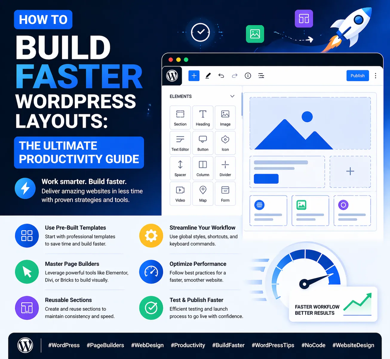
Time is one of the most valuable resources a WordPress designer or website owner has. Whether you’re building a site for your own business, designing pages for clients, or managing a growing portfolio of WordPress projects, the speed at which you can build clean, professional layouts directly impacts how much you can accomplish — and how profitable each project can be.
At 4GoodHosting, we power thousands of WordPress websites across Canada through our managed WordPress Hosting platform, with servers located in our Canadian Data Centers built for performance and reliability. One of the things we hear most from our customers is that they want to build better pages, faster — without sacrificing quality or consistency. That’s exactly what this guide is about.
In this comprehensive guide, we’ll walk through every major strategy, tool, and habit that professional WordPress designers use to build faster layouts without cutting corners. From mastering keyboard shortcuts and saved templates to building reusable style systems and organizing your workflow, these techniques will help you work smarter, deliver faster, and spend more time on the creative decisions that actually matter.
Before diving into the techniques, it’s worth understanding why building layouts faster isn’t just about saving time — it’s about improving quality too.
When building a page layout takes longer than it should, several problems arise. First, you spend more time on mechanical, repetitive tasks (adding rows, resizing columns, adjusting padding) and less time on the strategic and creative decisions that make a website genuinely effective. Second, when you’re moving slowly through mechanical work, you’re more likely to lose momentum and make avoidable errors. Third, slow layout workflows make it harder to iterate — to try different approaches, test different structures, and arrive at the best version of a design.
Faster layout building isn’t about rushing. It’s about eliminating friction so you can spend your cognitive energy where it matters most: on layout decisions, content hierarchy, visual design, and user experience. The techniques below help you do exactly that.
Keyboard shortcuts are the single highest-leverage productivity improvement available in any WordPress page builder. Most professional designers who work quickly have internalized a core set of keyboard shortcuts so deeply that they use them without thinking — freeing their attention for design decisions rather than mouse navigation.
While specific shortcuts vary between page builders, most modern WordPress page builders support the following core shortcut categories:
Pro tip: Spend 30 minutes with your page builder’s keyboard shortcut documentation and deliberately practice the 5–6 shortcuts you’ll use most. Within a week, they’ll be muscle memory and your layout speed will noticeably increase.
One of the highest-leverage investments you can make in your WordPress workflow is building a personal library of saved templates and layout sections. Every time you build a layout pattern you’re likely to use again — a feature card row, a testimonial section, a two-column media block, a pricing table, a CTA banner — save it as a template immediately.
Over time, this library becomes an enormous productivity asset. Instead of building common layout patterns from scratch every time, you drop in a saved template, update the content, and move on. What used to take 20–30 minutes now takes 2–3.
As your template library grows, organization becomes critical. Most page builders let you name templates when you save them. Use a consistent naming convention:
Group templates by category if your builder supports folders or tags. A well-organized template library is one you’ll actually use — a disorganized one you’ll ignore.
Pro tip: Every time you finish a project, spend 15 minutes reviewing the layouts you built and saving any reusable sections to your template library. Consistent curation turns this library into a compounding asset that makes every future project faster.
One of the biggest time sinks in WordPress layout work is manually applying the same colors, fonts, and spacing values to dozens of individual elements. Setting up a global style system before you build a single page eliminates this problem at the source.
When you define a global color palette, applying your brand color to a heading takes one click instead of entering a hex code. When you define a typography scale, setting an H2 to the right size is automatic. When you need to update your brand color across the entire site, changing one global value updates every element that uses it simultaneously.
Global styles don’t just save time during initial build — they save massive time during revisions. Client wants a slightly different shade of blue? Change one global value. Rebranding to a new font? Update the global typography setting. Without global styles, those changes require manually touching every element on every page.
Every time you add a new row to your page, your page builder asks you to choose a column layout. Most designers click through these selection screens quickly without thinking, but building a habit around column presets can save meaningful time across a full project.
Here are the column configurations worth memorizing and selecting instantly when you need them:
| Layout Need | Column Configuration | Use Case |
| Single full-width section | 1 column (100%) | Hero sections, full-width CTAs, separators |
| Equal two-column | 2 columns (50/50) | Media + text, two feature comparisons |
| Content + sidebar | 2 columns (70/30 or 66/33) | Blog posts, product pages with aside content |
| Three-column equal | 3 columns (33/33/33) | Feature cards, team members, service icons |
| Four-column equal | 4 columns (25/25/25/25) | Icon grids, small stat blocks, logo grids |
| Wide + two narrow | 3 columns (50/25/25) | Featured item with two supporting items |
| Asymmetric content | 2 columns (60/40) | Text-heavy layout with supporting visual |
Many page builders let you save custom column configurations as presets. If you use a specific column layout repeatedly — say, a 65/35 two-column for blog posts — save it as a named preset so you can select it with one click instead of manually dragging column dividers every time.
One of the most underused features in most WordPress page builders is the ability to copy styles from one element and paste them onto another. This single feature can dramatically accelerate layout work by eliminating the need to manually apply the same styling to multiple elements.
Here’s the typical workflow:
This workflow is especially powerful for feature card grids, pricing tables, testimonial sections, and any layout where multiple elements should look identical. Building one styled element perfectly and then copying its style is always faster — and more accurate — than trying to manually replicate the same settings by hand.
The single fastest way to maintain consistency and speed in a WordPress page builder is to embrace a build-once-duplicate-many workflow. The core principle is simple: never build the same thing twice from scratch.
When you need multiple rows with the same structural layout — same column configuration, same section padding, same background — build one row, configure it, then duplicate it as many times as needed. Update only the content inside each duplicate.
The same principle applies to individual modules. If you need six identical styled feature cards, build one perfect card, duplicate it five times, and update the icon, heading, and text in each copy. The styling — background, border, shadow, padding, font — is identical across all six because it was applied once.
For sites with multiple pages that share a common structure — say, ten individual service pages that all follow the same layout template — build one page completely, then duplicate it in WordPress and update the content for each additional page. This approach can turn a ten-page build into essentially the time cost of one page plus ten rounds of content updates.
Pro tip: Before duplicating, make sure the original is styled exactly right — including mobile responsive overrides. Every duplicate inherits all settings, including mobile, so getting it right once means getting it right everywhere.
Most WordPress page builders include a Navigator or Layer panel — a sidebar that shows the hierarchical structure of all elements on the page. Learning to use this panel effectively is one of the most underrated layout speed techniques.
Here’s how to get the most out of the Navigator panel:
One of the biggest layout speed killers is leaving all mobile responsive adjustments until the end of a build. When you’ve finished a full desktop layout and then open the mobile view, you’re often faced with dozens of elements that need individual adjustment — a daunting task that can take as long as the original desktop build.
The solution is to check and adjust mobile layout as you go, section by section:
This approach keeps mobile fixes small and manageable. Instead of facing 50 mobile issues at the end of a project, you handle 2–3 issues per section as you build. The total work is similar, but the psychological load is much lighter and errors are caught earlier.
Unoptimized images are one of the top causes of slow WordPress page builders — both in the editor and on the live site. When you’re working with large, uncompressed images in the page builder, the editor itself loads slowly, and previewing changes takes longer.
Before uploading any image to WordPress, run it through a compression tool:
Pre-optimized images mean your page builder editor runs smoother, your live pages load faster, and your Core Web Vitals scores improve — all of which directly benefit the experience your managed WordPress Hosting from 4GoodHosting delivers to your visitors.
Experienced WordPress designers follow a consistent build order on every page they create. This consistency reduces decision fatigue, creates predictable workflows, and makes it easy to pick up where you left off if you’re interrupted mid-build.
A recommended build order for most pages:
Following this order means you never style a module only to move it later, never apply mobile overrides that get overwritten by later desktop changes, and never find yourself deep in content editing when you should still be working on structure.
| Technique | Time Saved | Best Used For |
| Keyboard shortcuts | High | Everyday editing tasks — duplicating, undoing, saving |
| Saved template library | Very High | Repeating layout patterns across projects |
| Global styles setup | Very High | Consistent styling and fast site-wide updates |
| Column presets | Medium | Quickly setting up new rows with common configurations |
| Copy/paste styles | High | Replicating styling across multiple similar elements |
| Duplicate and iterate | Very High | Card grids, pricing tables, multi-page builds |
| Navigator panel | Medium | Navigating complex nested layouts |
| Mobile-as-you-go | High | Avoiding a large responsive backlog at end of project |
| Pre-optimized images | Medium | Faster editor performance and live site load times |
| Consistent build order | High | Staying organized and avoiding rework |
There’s one more factor that affects how quickly your WordPress layouts come together and how well they perform for real visitors: your hosting environment. A slow hosting server affects not just your live site but your editing experience too — a sluggish WordPress admin panel, slow page builder loading times, and delayed save operations all add friction to your layout workflow.
This is why 4GoodHosting’s managed WordPress Hosting is built specifically to make WordPress fast — in the editor and on the live site. Our servers, housed in Canadian Data Centers, are configured specifically for WordPress performance: fast SSD storage, server-level caching, optimized PHP, and a CDN-ready infrastructure that ensures every page you build loads quickly for every visitor.
With 4GoodHosting, you also get automatic WordPress and plugin updates handled for you, daily backups, free SSL, and expert WordPress support — so you can focus entirely on building fast, beautiful layouts rather than managing server infrastructure.
Mastering the techniques in this guide will transform your WordPress layout workflow — from slow, repetitive, and frustrating to fast, consistent, and genuinely enjoyable. And when your beautifully built pages are hosted on 4GoodHosting’s managed WordPress Hosting, they load instantly for every visitor, backed by the reliability of our Canadian Data Centers.
Every 4GoodHosting managed WordPress Hosting plan includes:
Whether you’re building your first WordPress site or you’re a seasoned designer looking to speed up a busy client workflow, 4GoodHosting provides the managed WordPress Hosting foundation your WordPress projects deserve — fast, reliable, and proudly powered by Canadian Data Centers.
Get started with 4GoodHosting today — Canada’s trusted managed WordPress Hosting provider, powered by Canadian Data Centers.
 June 11, 2026Canadian Hosting, Hosting, Web Hosting Canada
 June 9, 2026Commercial Window Repair, Glass Replacement Vancouver
 May 14, 2026Canadian Hosting, Hosting, Managed WordPress Hosting Canada, Web Hosting Canada
 May 14, 2026Canadian Hosting, Hosting, Managed WordPress Hosting Canada, Web Hosting Canada
 May 8, 2026Canadian Hosting, Hosting, Managed WordPress Hosting Canada, Web Hosting Canada
 May 7, 2026Canadian Hosting, Hosting, Managed WordPress Hosting Canada, Web Hosting Canada