 April 21, 2026
 Uncategorized
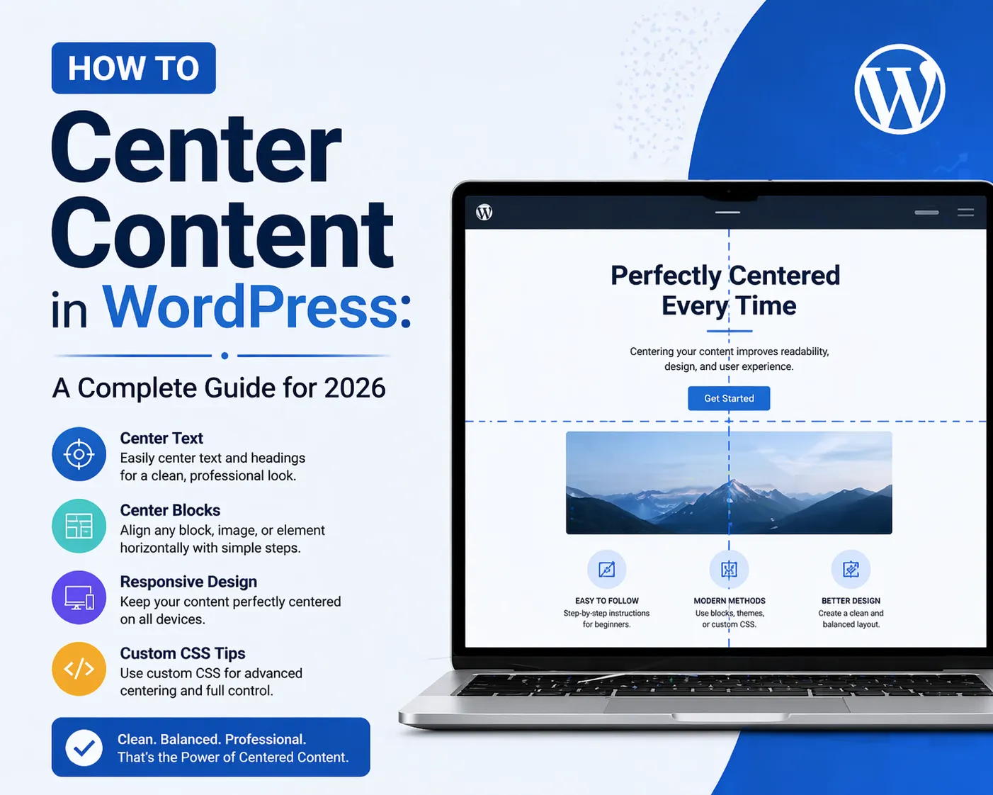
If you’ve ever spent more time than you’d like trying to get a button, image, or block of text to sit perfectly in the middle of your WordPress page, you’re not alone. Centering content is one of the most searched WordPress design questions — and for good reason. Depending on what you’re centering, where it lives on the page, and what tools you’re using, the approach can vary quite a bit.
At 4GoodHosting, we work with thousands of WordPress site owners across Canada through our managed WordPress Hosting platform, and layout questions come up all the time. Whether you’re a first-time WordPress user or a seasoned developer, this guide covers every reliable method for centering content in WordPress — from the simplest block editor clicks to advanced CSS techniques. Best of all, when your site is hosted on 4GoodHosting’s infrastructure in our Canadian Data Centers, every design change you make loads instantly for your visitors.
Let’s get into it.
Before diving into the how, let’s briefly talk about the why. Centering is one of the foundational design principles in web layout, and it serves several important purposes:
When you host your WordPress site with 4GoodHosting on our Canadian Data Centers, your site is served quickly regardless of screen size — but a well-centered design ensures it also looks great on every device.
The Block Editor — also known as Gutenberg — is the default content editor in WordPress. Centering text here is as simple as it gets.
Your text will immediately center within the block. This works for all text-based blocks: paragraphs, headings, lists, quotes, and more.
Note that the above method centers the text inside the block. If you want to center the block itself within the page column, that’s handled differently:
The Group block is a container that lets you wrap multiple blocks together and apply shared styling. To create a centered content section:
This is great for centering a combination of elements — like a centered heading above a centered paragraph above a centered button.
If you’re using a drag-and-drop WordPress page builder, you have more visual, intuitive control over centering. Here’s how it works in most modern page builders.
Every page builder organizes content in rows and columns. The alignment settings for rows and columns directly control how the content inside them is positioned.
Horizontal alignment (justify-content):
Vertical alignment (align-items):
For centering, you’ll typically set both horizontal and vertical alignment to Center in the row or column settings.
Beyond the column, each individual module usually has its own alignment setting:
When building full-width sections, you often want the content to be centered within the section but constrained to a readable width. Here’s the standard approach:
This pattern — full-width section, centered constrained column — is one of the most commonly used layouts on professional websites.
Advanced page builders expose raw flexbox alignment settings. If you see options labeled Flex Direction, Justify Content, and Align Items, you have flexbox control:
These settings apply to the direct children of the container, giving you precise layout control without any custom CSS.
Sometimes you need more precise control than the editor offers. CSS is the definitive way to center anything on the web. Here are the techniques you’ll use most in WordPress.
You can add custom CSS in WordPress at Appearance → Customize → Additional CSS. Any styles you write here apply site-wide. If you only want styles to apply to a specific block, add a custom CSS class to that block, then target that class in your CSS.
.your-class {
text-align: center;
}
text-align: center centers all inline content within their parent container. It’s the simplest and most widely supported centering technique.
.your-class {
display: block;
margin-left: auto;
margin-right: auto;
max-width: 800px;
}
The margin: 0 auto trick works for any block-level element with a defined width or max-width. The browser divides the remaining horizontal space equally on both sides.
.container {
display: flex;
justify-content: center; /* horizontal centering */
align-items: center; /* vertical centering */
min-height: 400px;
}
Flexbox is the modern standard for centering in CSS. Apply this to a container, and everything inside it is centered both horizontally and vertically.
.container {
display: grid;
place-items: center;
min-height: 400px;
}
place-items: center is one of the cleanest centering solutions in modern CSS — a shorthand for align-items and justify-items set to center.
.your-element {
position: absolute;
top: 50%;
left: 50%;
transform: translate(-50%, -50%);
}
This moves the element to the center of its nearest positioned ancestor, then shifts it back by half its own dimensions for perfect centering.
Images deserve special attention because they behave differently from text.
The image will center within the content column.
img.centered-image {
display: block;
margin: 0 auto;
max-width: 100%;
height: auto;
}
Buttons are one of the most important elements to center correctly — your call-to-action needs to be prominent and perfectly positioned.
Most page builder button modules have a dedicated alignment control. Set it to Center in the module’s style or layout settings.
.wp-block-buttons {
justify-content: center;
}
Centering the text inside a block and centering the block itself are two different things. Use margin: 0 auto on the block element to center it within its parent.
This is a responsive layout issue. Open your browser’s developer tools (F12), switch to mobile view, and check which CSS rule is overriding your centering on smaller screens. Most page builders also have separate mobile alignment controls.
Add a max-width to your centered container. A common setting for readable text is 700–800px. For hero sections, 1000–1200px is typical.
Images are often display: inline by default, which can prevent margin: auto from working. Make sure your image has display: block set before applying margin: 0 auto.
Use your browser’s developer tools to inspect the element. Look for unexpected padding or margin on the element or its parent. Many WordPress themes add default padding to content areas that can throw off centering.
| What to center | Best method |
| Text in a block | Block editor alignment toolbar |
| A block on the page | margin: 0 auto with max-width |
| Content in a page builder column | Column alignment settings (justify-content: center) |
| An image | Block toolbar → center, or display: block; margin: 0 auto |
| A button | Buttons block justification, or page builder alignment |
| Content vertically + horizontally | Flexbox: display: flex; justify-content: center; align-items: center |
| Anything, cleanly | CSS Grid: display: grid; place-items: center |
Mastering content alignment is one piece of the puzzle — but great design also needs great hosting underneath it. 4GoodHosting’s managed WordPress Hosting gives your site the fast, secure, and reliable foundation it needs to perform at its best.
Here’s what you get with 4GoodHosting:
Whether you’re building a personal blog, a business website, or a full e-commerce store, 4GoodHosting has a managed WordPress Hosting plan for you — all powered by our infrastructure in Canadian Data Centers that you can count on.
Get started with 4GoodHosting today — give your WordPress site the home it deserves: fast, secure, and proudly Canadian.
 June 11, 2026Canadian Hosting, Hosting, Web Hosting Canada
 June 9, 2026Commercial Window Repair, Glass Replacement Vancouver
 May 14, 2026Canadian Hosting, Hosting, Managed WordPress Hosting Canada, Web Hosting Canada
 May 14, 2026Canadian Hosting, Hosting, Managed WordPress Hosting Canada, Web Hosting Canada
 May 8, 2026Canadian Hosting, Hosting, Managed WordPress Hosting Canada, Web Hosting Canada
 May 7, 2026Canadian Hosting, Hosting, Managed WordPress Hosting Canada, Web Hosting Canada