 April 21, 2026
 Canadian Hosting, Hosting, Managed WordPress Hosting Canada, Web Hosting Canada
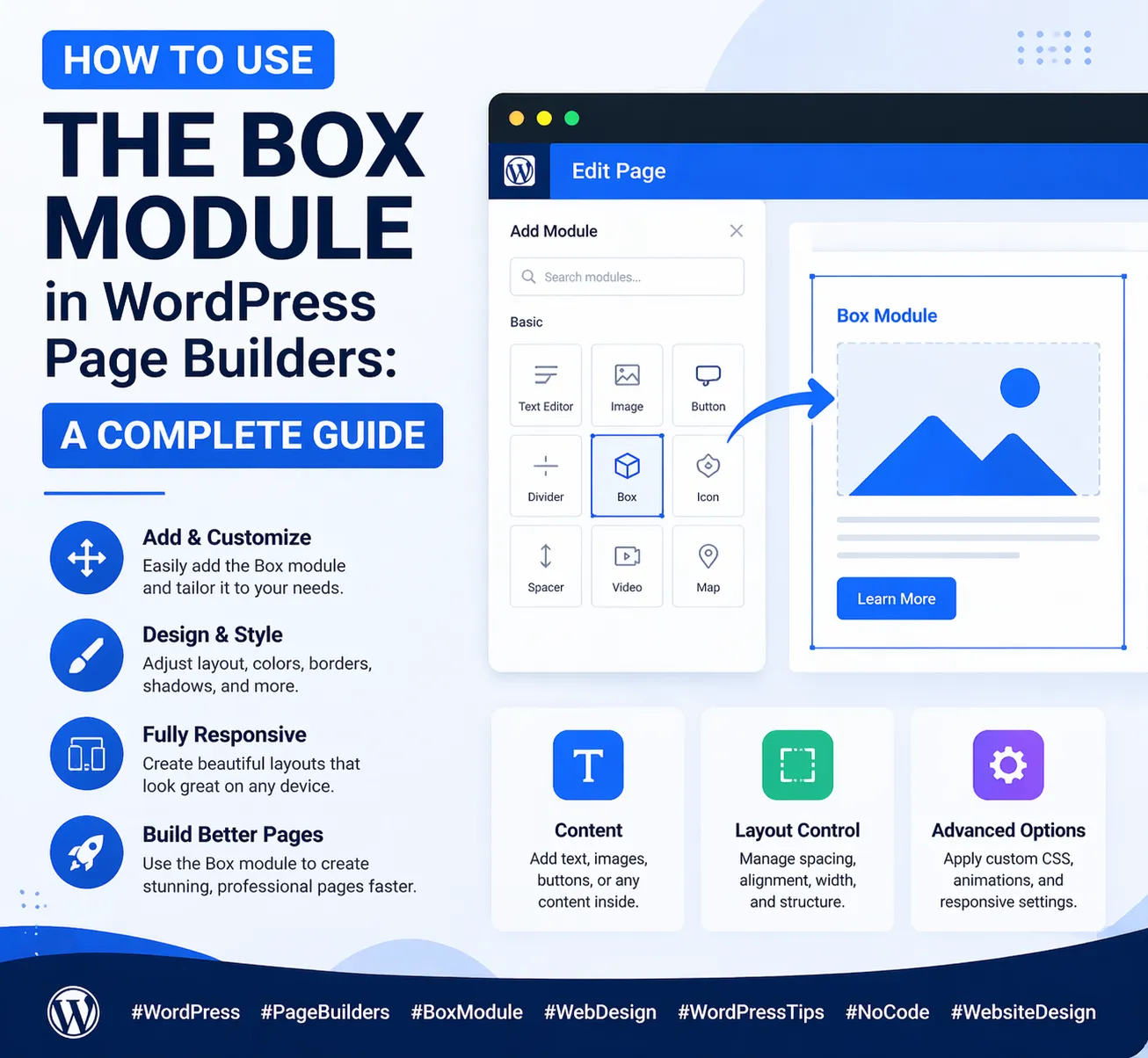
If you’ve spent any time building pages in a WordPress page builder, you’ve probably come across the Box module — sometimes called a Container, Wrapper, or Div block depending on which builder you use. At first glance, it might seem like a basic or even unnecessary element. But experienced WordPress designers know the truth: the Box module is one of the most powerful and versatile tools in the entire page builder toolkit.
At 4GoodHosting, we support thousands of WordPress websites through our managed WordPress Hosting platform, with servers housed in Canadian Data Centers built for speed, security, and reliability. Through supporting our customers’ WordPress journeys every day, we know that understanding how to use foundational elements like the Box module is the difference between a layout that looks amateur and one that looks like it was built by a professional design agency.
In this comprehensive guide, we’ll walk you through everything you need to know about the Box module in WordPress page builders — what it is, why it matters, how all its settings work, and how to use it to build some of the most common and effective layout patterns in modern web design. By the end, you’ll have the knowledge to use this single module to create feature cards, testimonial sections, pricing blocks, media layouts, call-to-action boxes, and much more.
The Box module is a container element — a styled wrapper that holds other content inside it. Think of it as a <div> in HTML: a block-level element with no inherent visual style of its own, but with the ability to receive any styling you apply to it — background color, border, shadow, padding, corner radius, and more — while housing any other modules inside it.
What makes the Box module especially powerful is the combination of two capabilities:
This dual nature — styled container plus layout controller — is what makes the Box module so indispensable. It solves two design problems at once: how should this block look? and how should the content inside it be arranged?
Without the Box module, building complex nested layouts would require custom CSS or separate row/column elements that can’t be independently styled. With the Box module, you can create highly structured, visually rich layouts entirely within the page builder’s visual interface.
To use the Box module effectively, you need to understand what each setting does. Let’s go through every major control group systematically.
The Box module’s dimensions control how much space it occupies on the page.
Padding and margin are the spacing controls, and they’re among the most important settings in the Box module.
A common mistake is mixing up padding and margin. Remember: padding goes inside (affects the background area), margin goes outside (affects spacing with neighbors).
The background of the Box module is where much of its visual character comes from. Most page builders offer several background options:
Border controls define the box’s edge treatment:
Box shadow adds depth to the Box module by creating the illusion that it’s elevated above the surface behind it. A well-crafted shadow can transform a flat card into a visually dimensional element.
Shadow parameters to understand:
This is arguably the most powerful section of the Box module settings. Flexbox controls dictate how the direct children of the Box — all the modules nested inside it — are arranged.
The real value of the Box module becomes clear when you see it in action. Here are five of the most common and effective layout patterns you can build using the Box module in your WordPress page builder.
The feature card grid — three or four cards in a row, each with an icon, heading, and short description — is one of the most universally used layouts on the web. The Box module is the natural building block for this pattern.
How to build it:
For consistency, set a min-height on all three boxes so they stay the same height even if one has more text than the others.
Testimonial sections build trust and social proof. A well-styled testimonial uses the Box module for the outer card and inner content arrangement.
How to build it:
The nested Box module for the attribution row handles the horizontal layout of the avatar image and name text, while the outer Box handles the overall card styling.
A CTA banner draws attention and drives action. The Box module makes it easy to create a visually distinct, full-width call-to-action section.
How to build it:
For mobile, add a responsive override: change flex direction to Column and justify content to Center so the heading and button stack vertically and center-align on smaller screens.
The media-and-text layout — an image on one side, text content on the other — is a staple of content marketing pages and landing pages.
How to build it:
Alternate the image/text order on consecutive sections (image left, then image right) to create visual variety and rhythm down the page.
Pricing tables are a classic conversion element, and the Box module makes building them intuitive. Each pricing tier is its own Box module, with the featured plan styled differently to draw attention.
How to build it:
As your page grows, the layer panel can quickly become a confusing list of unnamed “Box” elements. Get into the habit of naming every Box module as soon as you create it — “Feature Card 1”, “Testimonial – Sarah”, “CTA Banner”. This makes navigating complex pages dramatically faster and reduces the chance of accidentally editing the wrong element.
Never build the same styled box from scratch multiple times. Build one box, style it exactly as you want it, then duplicate it as many times as needed and update only the content inside each copy. This ensures every box in a series is pixel-identical in its styling — something that’s nearly impossible to achieve if you style each one individually.
Not every Box module needs visible styling. Sometimes you want the layout control benefits of a Box module — flexbox direction, gap, alignment — without any visual border or background. Setting the Box to transparent with no border gives you a pure layout container that’s invisible to the visitor but powerful for the designer.
Many WordPress page builders allow you to define hover state styles on Box modules — a slightly darker background, a deeper shadow, a border color change, or a subtle scale transformation. Adding hover effects to clickable boxes (like feature cards that link to individual service pages) signals interactivity to the user and adds a polished, professional touch to the design.
Box modules can be nested inside other Box modules, which is often useful (as in the testimonial example above). However, avoid nesting more than two or three levels deep. Deep nesting creates layouts that are difficult to edit, hard to debug when something looks wrong, and can cause unexpected behavior with flexbox properties that cascade through nested containers.
When spacing out child elements inside a Box module, use the Gap control on the parent Box rather than adding margin to individual child elements. Gap spacing is cleaner, easier to manage, and doesn’t create double-spacing issues at the edges. If your page builder exposes the gap control, make it your default approach to spacing within boxes.
| Setting | What It Controls | Common Use Case |
| Width / Min-height | Box dimensions | Equal-height card rows |
| Padding | Space inside the box | Card breathing room (30–40px) |
| Margin | Space outside the box | Gap between sections |
| Background color | Box fill color | Card backgrounds, CTA banners |
| Border radius | Corner rounding | Card look (8–12px) |
| Box shadow | Depth and elevation | Lifted card effect |
| Flex direction | Child layout axis | Row (side-by-side) or Column (stacked) |
| Justify content | Main axis alignment | Space-between for CTA banners |
| Align items | Cross axis alignment | Center for vertically centered content |
| Gap | Spacing between children | Consistent child element spacing |
The Box module enables richer, more complex page layouts — and richer layouts mean more HTML elements, more CSS rules, and more rendering work for the browser. On well-optimized hosting, this extra complexity is invisible to the visitor. On poorly optimized hosting, it can result in noticeable layout shifts, slow rendering, and a poor Core Web Vitals score.
This is one of the reasons why 4GoodHosting’s managed WordPress Hosting matters so much for design-focused WordPress sites. Our platform is purpose-built to serve WordPress efficiently: server-level caching, optimized PHP configuration, fast SSD storage, and a CDN-ready infrastructure all work together to ensure your page builder layouts — no matter how many Box modules, nested containers, and flexbox grids they contain — load fast for every visitor.
And because our infrastructure is built on Canadian Data Centers, Canadian visitors benefit from the lowest possible latency. Your meticulously designed Box module layouts render instantly, with no layout shifts or delayed paint that could undermine the professional impression you’ve worked so hard to create.
The Box module is one of those WordPress page builder features that seems simple at first but reveals its true depth the more you use it. Master the Box module and you unlock the ability to build virtually any layout pattern modern web design demands — from clean feature card grids to sophisticated nested testimonial blocks to dynamic pricing tables.
And when your beautifully crafted Box module layouts are hosted on 4GoodHosting’s managed WordPress Hosting, they’re backed by infrastructure that’s as reliable and high-performing as your design is polished.
Every 4GoodHosting managed WordPress Hosting plan includes:
Whether you’re a first-time WordPress builder learning the ropes or an experienced designer crafting complex multi-section layouts for clients, 4GoodHosting provides the managed WordPress Hosting foundation your WordPress site deserves — powered by Canadian Data Centers and built for WordPress performance from the ground up.
Get started with 4GoodHosting today — Canada’s trusted managed WordPress Hosting provider, powered by Canadian Data Centers.
 June 11, 2026Canadian Hosting, Hosting, Web Hosting Canada
 June 9, 2026Commercial Window Repair, Glass Replacement Vancouver
 May 14, 2026Canadian Hosting, Hosting, Managed WordPress Hosting Canada, Web Hosting Canada
 May 14, 2026Canadian Hosting, Hosting, Managed WordPress Hosting Canada, Web Hosting Canada
 May 8, 2026Canadian Hosting, Hosting, Managed WordPress Hosting Canada, Web Hosting Canada
 May 7, 2026Canadian Hosting, Hosting, Managed WordPress Hosting Canada, Web Hosting Canada